

The Political Geography of New York City
A Story in 14 or 15 Clusters

As I have worked in New York City politics for the last decade, I have learned a kind of shorthand for maps, a mental model of which neighborhoods vote which way and why. When I’m giving a presentation or just talking to a few people, the shorthand is good enough to get by. But when I started writing up the 2025 New York City election newsletter, I realized that this shorthand would not suffice. There are too many overlapping and complex dynamics and hand-waving them would be unconvincing.
So I did what anyone in this situation would do. I built a statistical model.
In some ways this is just a newsletter about how cool machine learning is. I put together a set of data with election results and census demographics by New York City election districts and I fed them into a “Gaussian Mixture Model” to create clusters of similar election districts, and of the 20 clusters it created, 15 had clear and coherent stories, and shockingly coherent geographies, despite the lack of geographic markers in the data. I merged two of the clusters into one group because they made more sense together than apart, and so that left me with 14.
(For a little more on the method and process, see the Appendix on Method at the conclusion of this newsletter.)
I should say here that writing about political geography entails making generalizations about populations. In many of these areas, there are large groups making up 20 percent or more of the population whom I do not discuss. That does not mean they are unimportant. Further, obviously a majority 70 percent of a particular population, whether black or East Asian, lower income or college educated, is made up of many thousands of people irreducibly different from one another. What this analysis seeks to do is not to deny those obvious facts about people. Rather, I think it is striking that despite the ways people are ever unpredictable and changing, we can still identify population level trends by geography and electoral and demographic factors.
Let’s get into the different groups.
The Mamdani Base
The core of Zohran’s base in the primary and the general lay in the Brooklyn and Queens waterfront neighborhoods of Greenpoint, Williamsburg, Bushwick and Astoria.
Mamdani put up margins of 60 points and more in these districts, amid surging voter turnout. This cluster also has the highest percentage of younger adults of any that the model identified. It is professional-class and highly educated but not exceptionally high-income. These are areas with multiple Democratic Socialist local representatives already, and it is hardly surprising they supported a DSA Mayoral candidate.
Several other areas also gave large support to Mamdani, and while these areas are significantly different, perhaps what ties them together most is a high percentage of young people and professional-class voters.
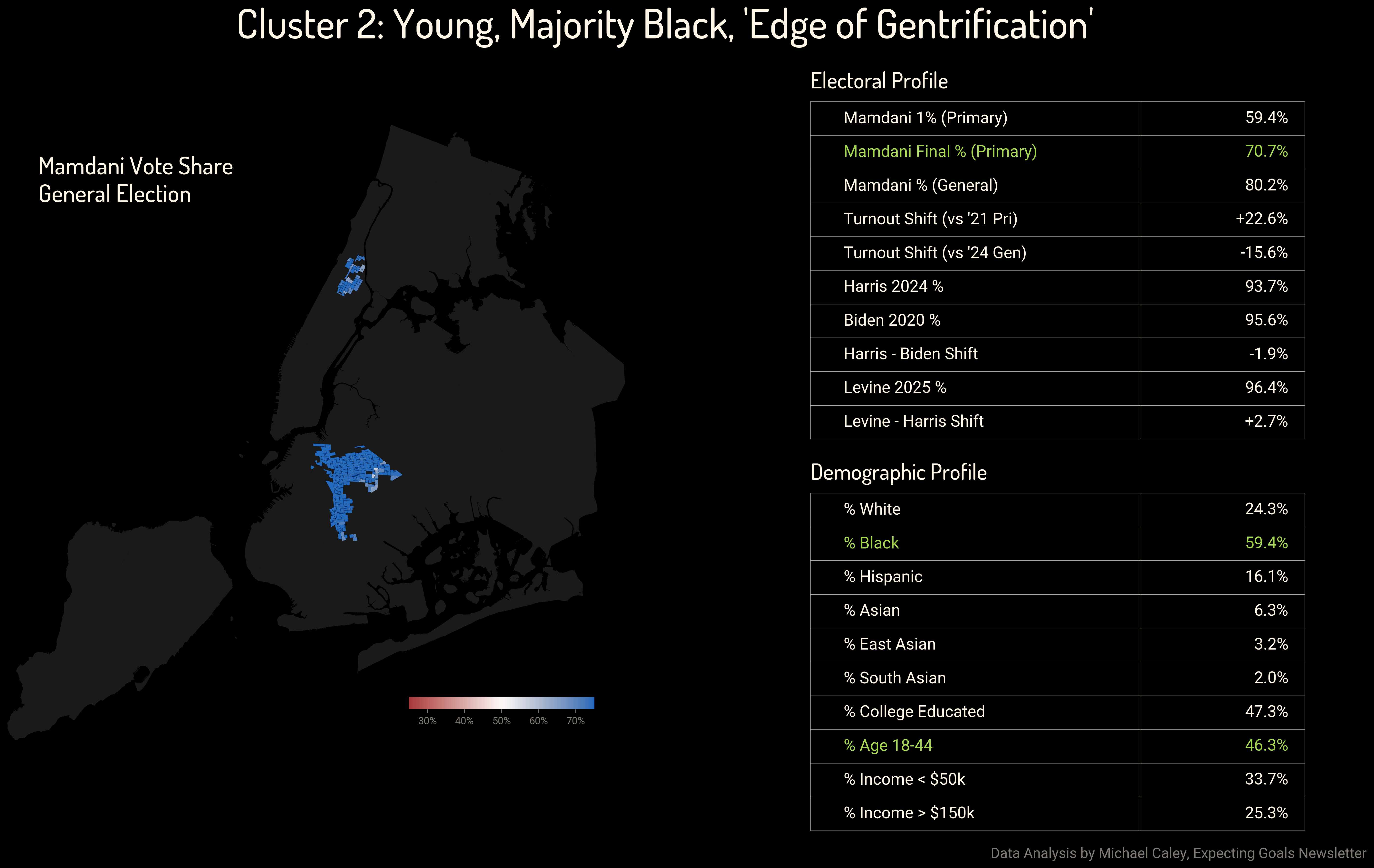
This captures large sections of the neighborhoods of Clinton Hill, Crown Heights, Bedford-Stuyvesant, Prospect-Lefferts Gardens and Flatbush in Brooklyn, and Central Harlem in Manhattan. These are majority black areas with significant young, college-educated, left-progressive populations. Mamdani did not quite rack up the same majorities here as he did in North Brooklyn and Astoria but it was close.
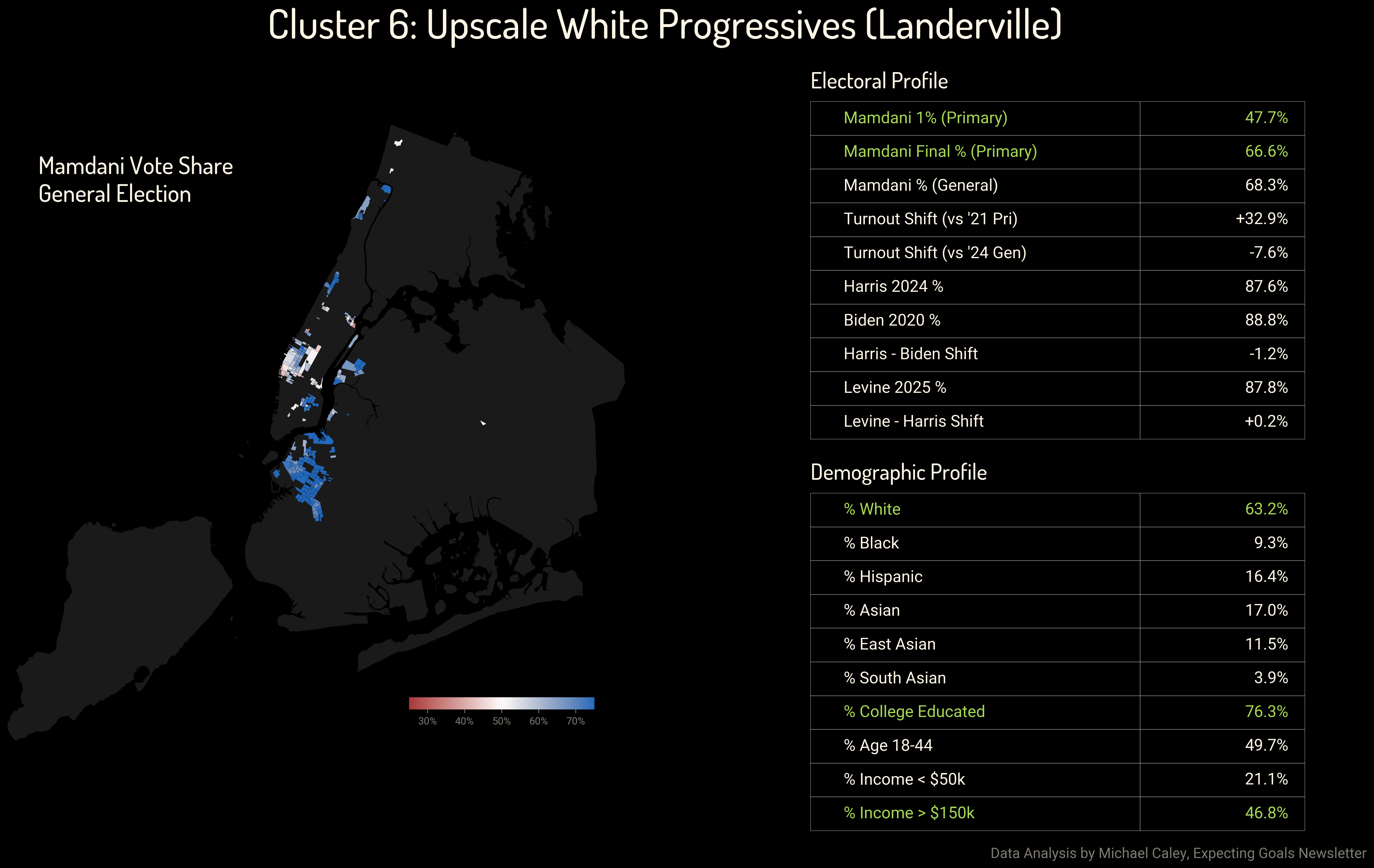
Although Mamdani got far fewer 1st place votes in the ranked-choice primary here than he did in the previous cluster, nonetheless when the ranked choice voting was completed he had two-thirds of the vote. In these affluent, professional-class, white progressive areas, voters used their full ballots and Brad Lander got his best numbers in the mayoral race. Thanks to the ranked-choice system and Lander’s full-throated cross-endorsement with Mamdani, those votes were eventually assigned to Mamdani.
This map shows the neighborhoods of Park Slope, Carroll Gardens and Boerum Hill in Brooklyn, Long Island City in Queens, and a bit of the East Village, Chelsea and Hell’s Kitchen in Manhattan. The best thing about this map is how it identified Morningside Heights, near Columbia University, as sharing these qualities with Park Slope.
I am not sure if the identification of these particular Manhattan neighborhoods—Morningside Heights aside—as being significantly different from the rest of affluent, primarily-white Manhattan is correct. As we go through more of these and my grasp of the political geography gets progressively weaker outside Brooklyn, I will have more uncertainty.
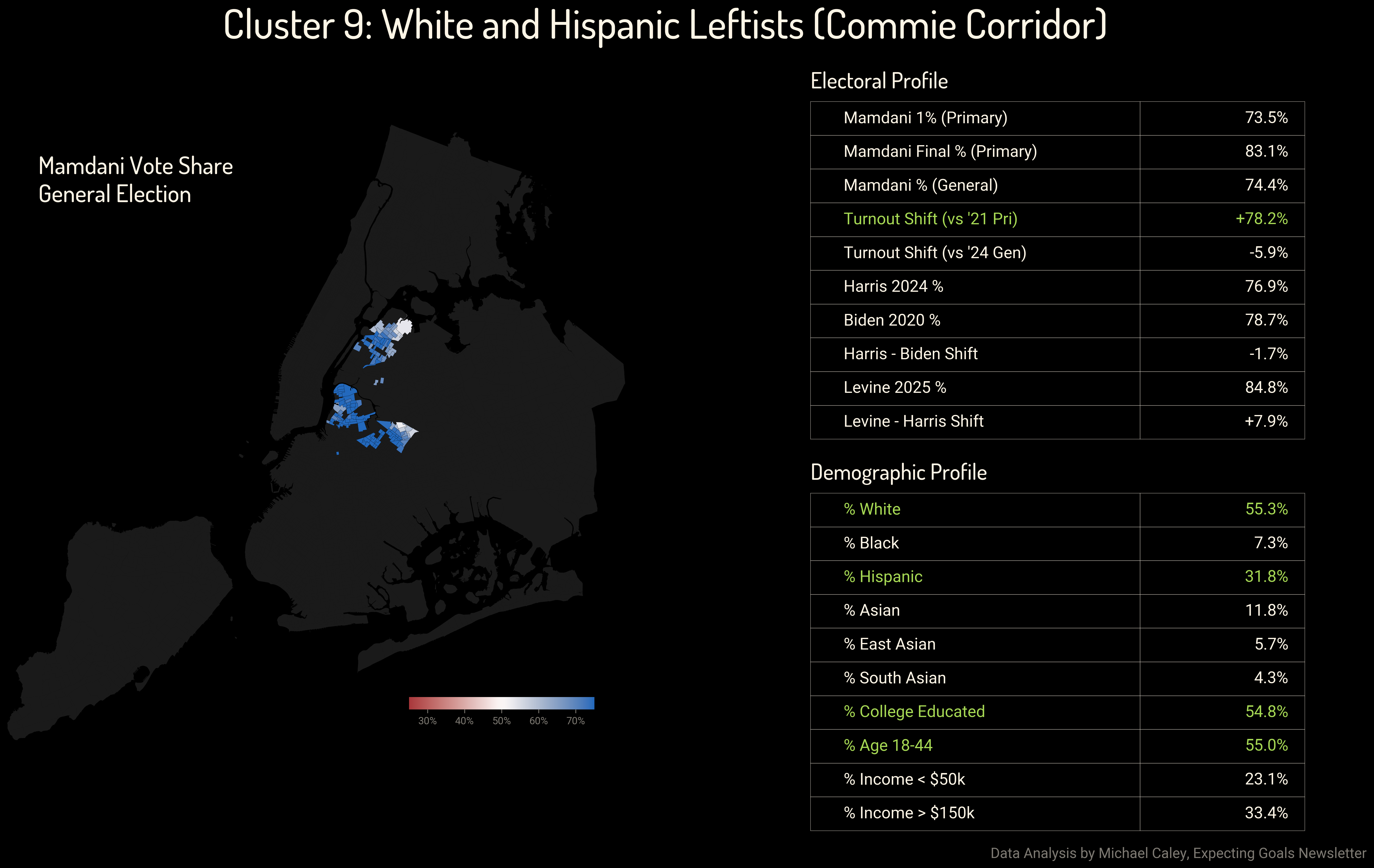
This cluster, even more so than the previous one, is not quite as geographically coherent, with a few little dots strewn around on perhaps dubious grouping logic. But the core of it remains compelling to me. We have chunks of Williamsburg and Bushwick in North Brooklyn, Red Hook and Sunset Park on the Brooklyn waterfront, a bit of the Lower East Side, Spanish Harlem, West Harlem and Washington Heights in Manhattan. These are lower-income areas, majority Hispanic with significant white and black populations, but again very young and with a significant college-educated minority. Mamdani’s margins here were not as enormous as in the above clusters, but he won in both the primary and the general by over 20 points.
Here we also see the first story of the 2020s shift to the right. Trump gained seven points in these districts between 2020 and 2024, but in the down-ballot Comptroller race in 2025, Mark Levine won those voters back and more.
For a fuller analysis of the recent Republican trend in New York City’s voting and whether 2025 saw it reversed, see the 2025 election analysis newsletter, to which this post is a companion.
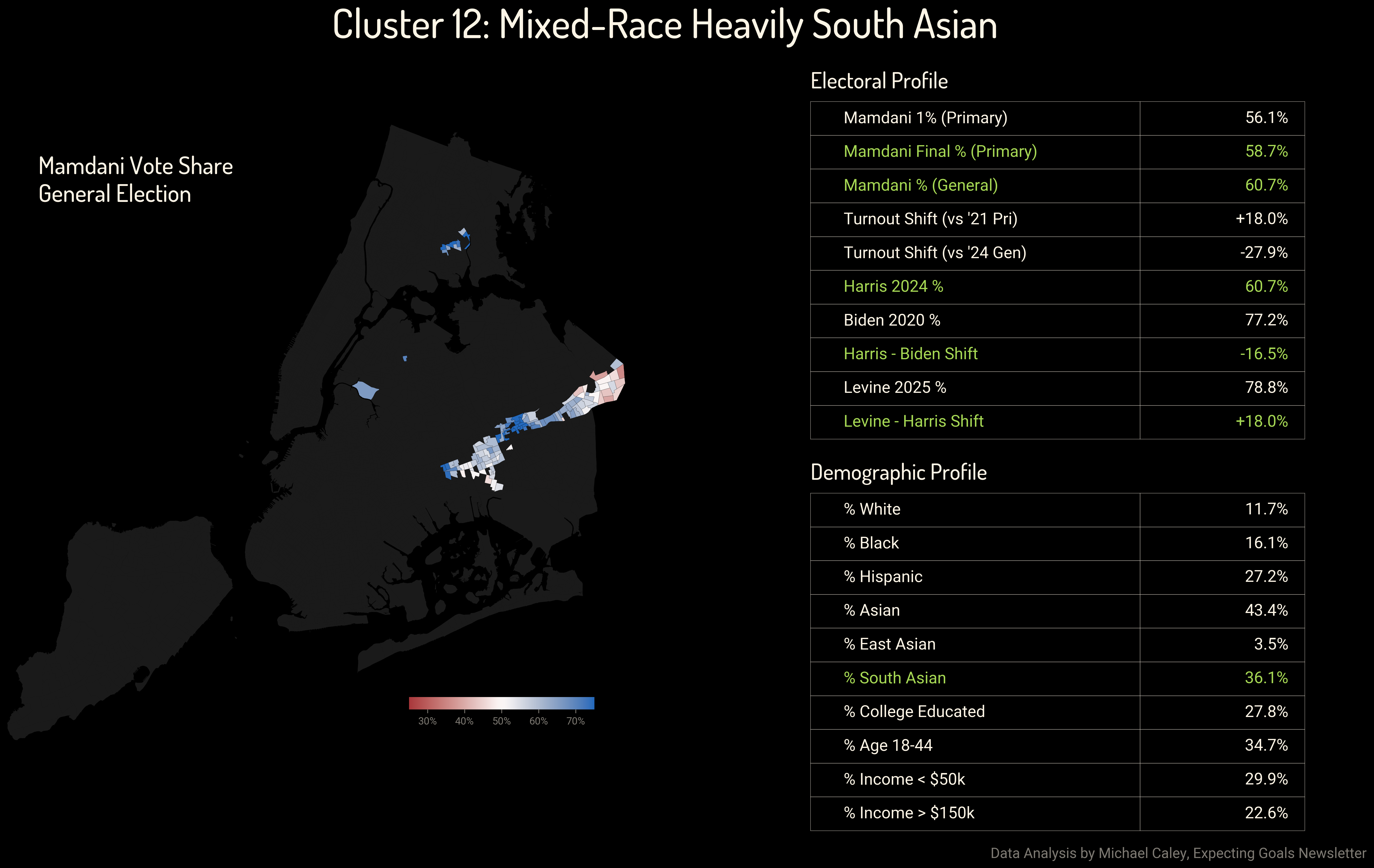
This map cuts a swath through a series of central and eastern Queens neighborhoods, including Richmond Hill, Ozone Park, and South Ozone Park. These are mixed-race and heavily South Asian areas where Mamdani ran shockingly strong in both the primary and the general election compared to the recent level of Democratic support. He won 61 percent of the vote in the November election, just about exactly equal to Kamala Harris’ share in 2024. If you wanted to look for Trump-Mamdani voters, this is where you should go. It seems very plausible that a South Asian candidate running for Mayor was able to connect with and win over an unusual number of South Asian voters, even among those who had trended away from Democrats in recent elections.
Here, support for Mamdani coincided with a dramatic shift back toward Democrats. Harris had lost 16 points of support from Biden in 2020, and Levine won it all back even beyond Mamdani’s impressive win.
Swing Areas in the Primary
During the primary, Mamdani ran surprisingly strong in a number of areas where Democrats had mostly struggled recently. Generally he did not end up with majorities in these neighborhoods in the general election because large numbers of conservatives did eventually turn out to vote. But his margins in the primary made up a meaningful part of his victory, and we see a number of hopeful signs for Democrats in the general election results.
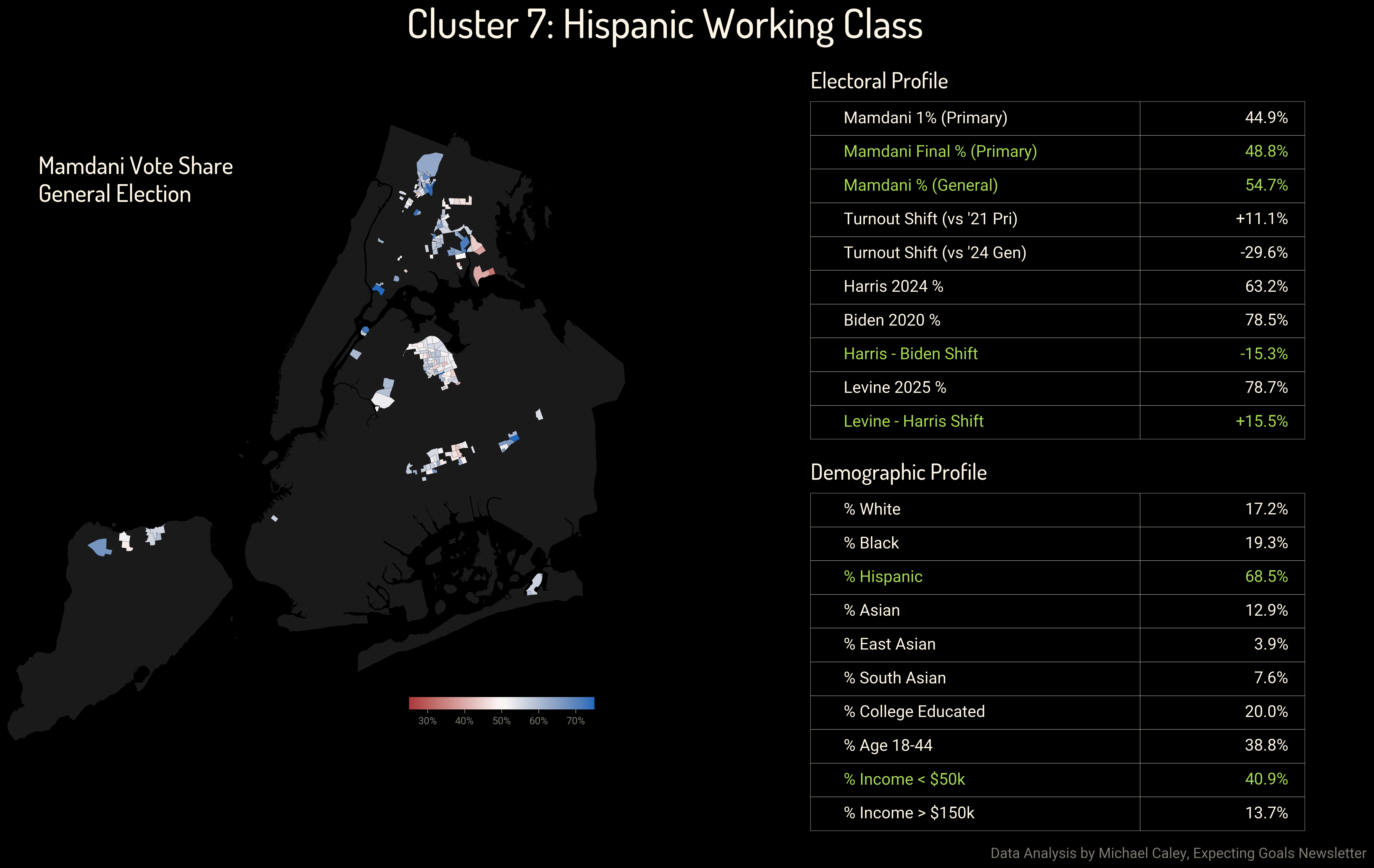
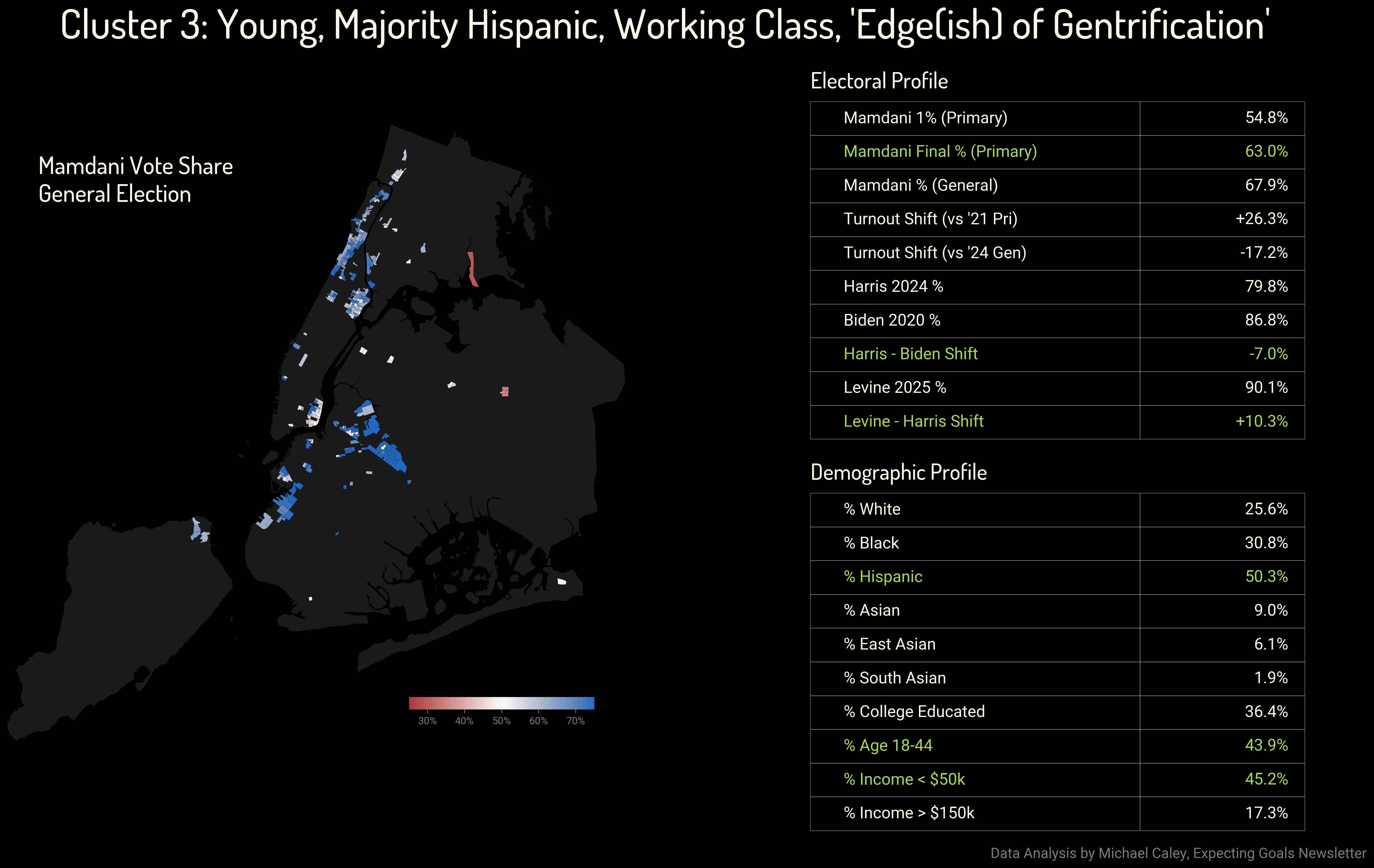
This is another somewhat spotty cluster, but I think it still captures something. We have heavily Hispanic, working class neighborhoods of Woodhaven, Elmhurst, and Corona in Queens, as well as some chunks of the Bronx. We can see here that lower-income, more moderate Hispanic voters supported Mamdani in significant numbers in the primary and the general election. And just as with the heavily South Asian areas above, this coincided with a massive reversion to Democratic support in down-ballot elections. Where Harris had fallen to 63 percent support in 2024, Mark Levine won 79 percent just one year later.
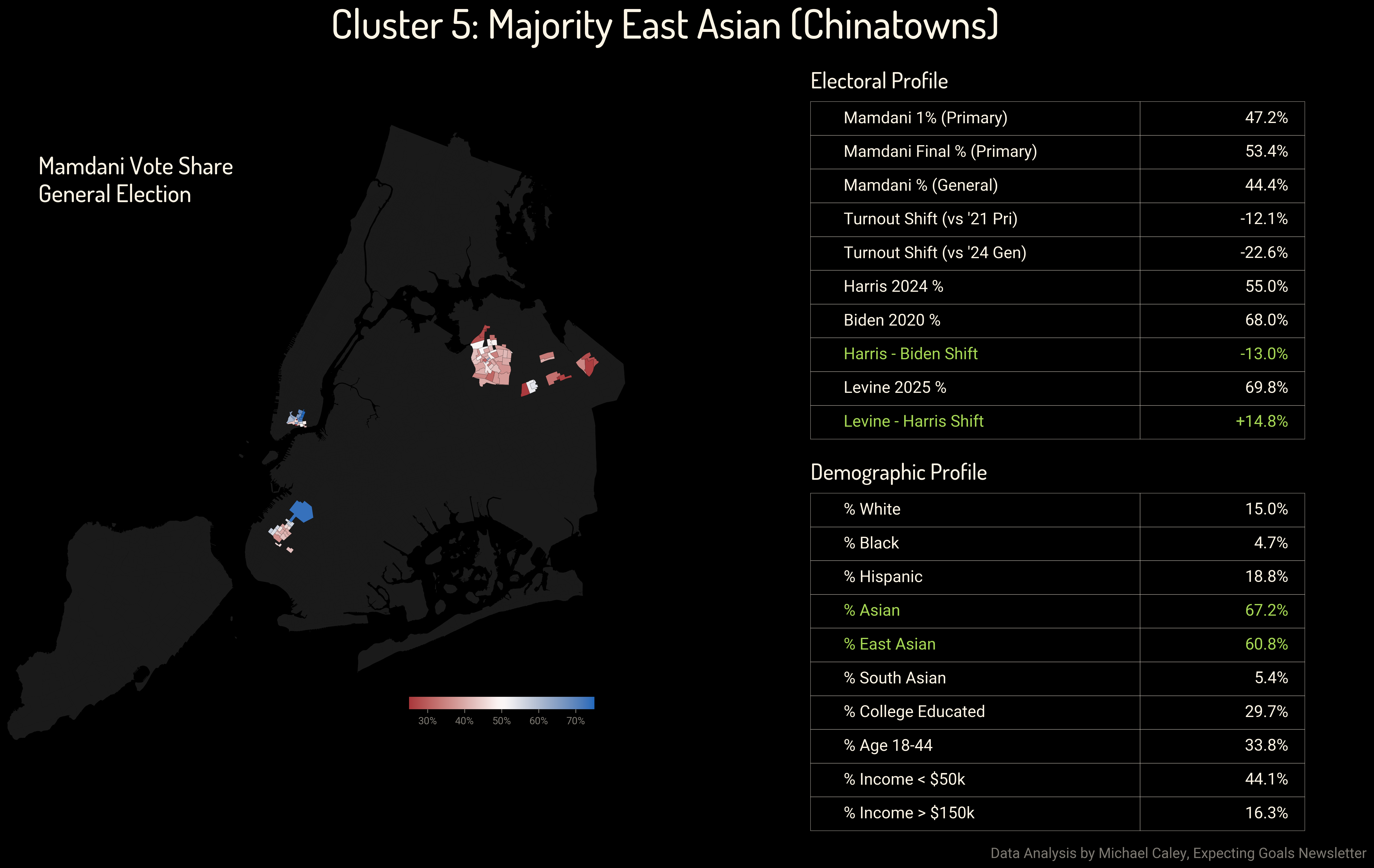
Mamdani actually won a small majority in the primary in Flushing, Sunset Park, and Manhattan Chinatown, but a more conservative general electorate made these swing regions in November. Here, strikingly, we see the same pattern of recent Democratic losses being reversed, but now in an area where Andrew Cuomo also received a large share of the vote. Voters in New York City’s Chinatowns were splitting their tickets, not supporting the Democratic nominee for Mayor but backing down-ballot Democrats like Mark Levine by high margins that hadn’t been seen in some years.
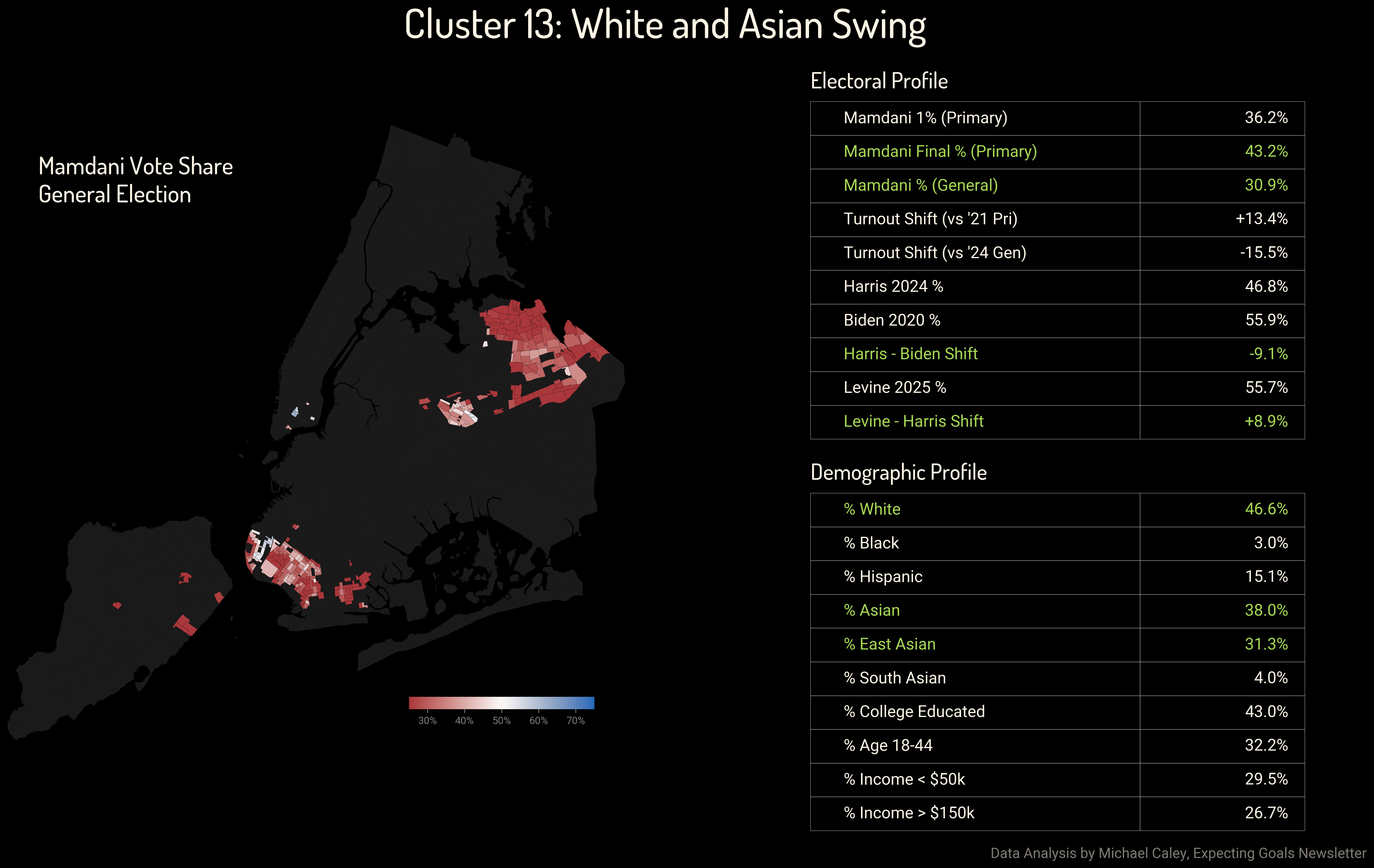
Large areas of Southern Brooklyn and Northeastern Queens with a mixed White and Asian population have leaned to the right in recent years. In Bayside and Bensonhurst, voters backed Cuomo in both the primary and general election, by notably larger margins in the general. But at the same time, down-ballot Democrats like Mark Levine and Kayla Santosuosso in Southern Brooklyn managed to win majorities. These areas are more conservative on the whole than Flushing and Sunset Park, with larger populations of conservative white voters, but they swung back to Democrats in 2025 nonetheless.
Swing Areas in the General
The story of the 2025 Mayoral election was that Andrew Cuomo couldn’t hold on to his base. The middle- and working-class moderate Democrats who backed him in the primary ended up giving small majorities to Mamdani in the general.
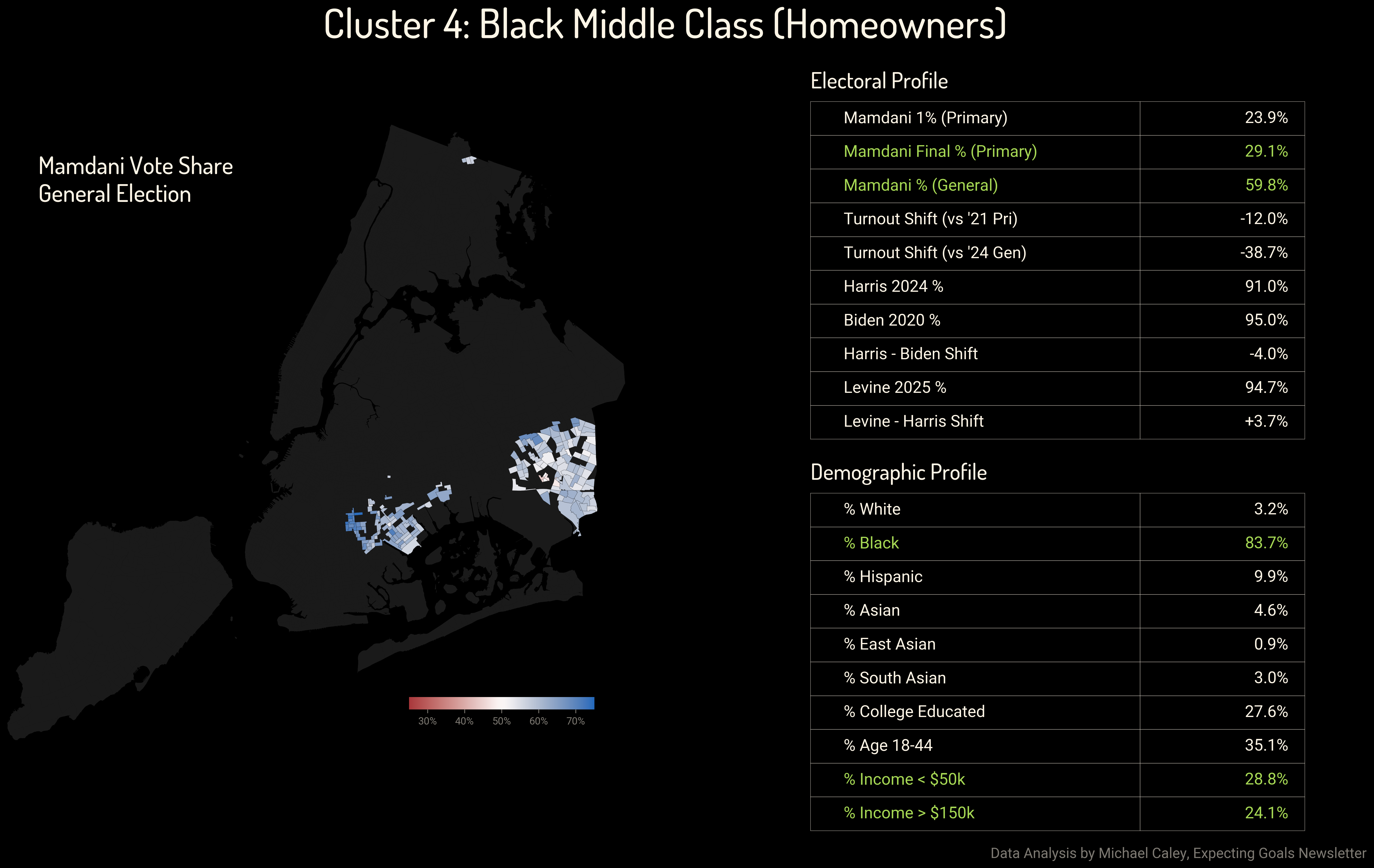
In the black middle class neighborhoods of Southeastern Queens—Jamaica, Springfield Gardens, Queens Village, Rochdale, Cambria Heights, and Laurelton among others—Cuomo managed 40 point majorities in the primary, albeit with depressed turnout. Flatlands and Canarsie in Brooklyn showed similar numbers. But in the general election, majorities of voters in these 90+ percent Democratic neighborhoods ended up preferring Zohran Mamdani. The election was lost when Cuomo could not hold on to these votes, and it was never clear that he or his campaign understood this was where the election would be decided.
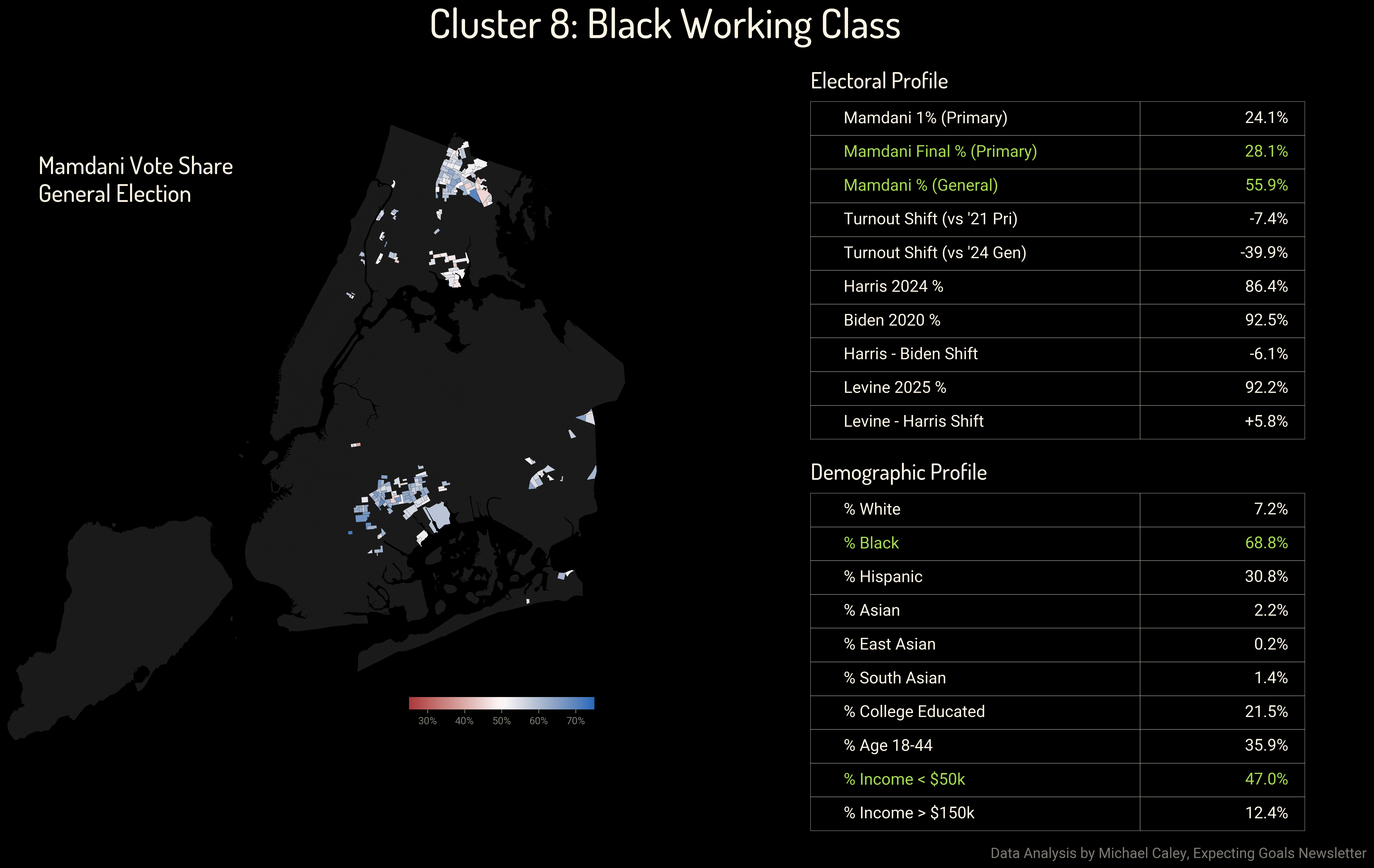
We see an extremely similar story in the lower-income neighborhoods of East Flatbush, Brownsville and East New York in Brooklyn, and in the Northeast Bronx. A nearly 30-point shift toward Mamdani from the primary to the general.
Both this and the preceding cluster demonstrate that there was much less of a shift to the right among black voters in New York City than among Hispanic and Asian voters. What small shifts did occur also appear to have disappeared in 2025.
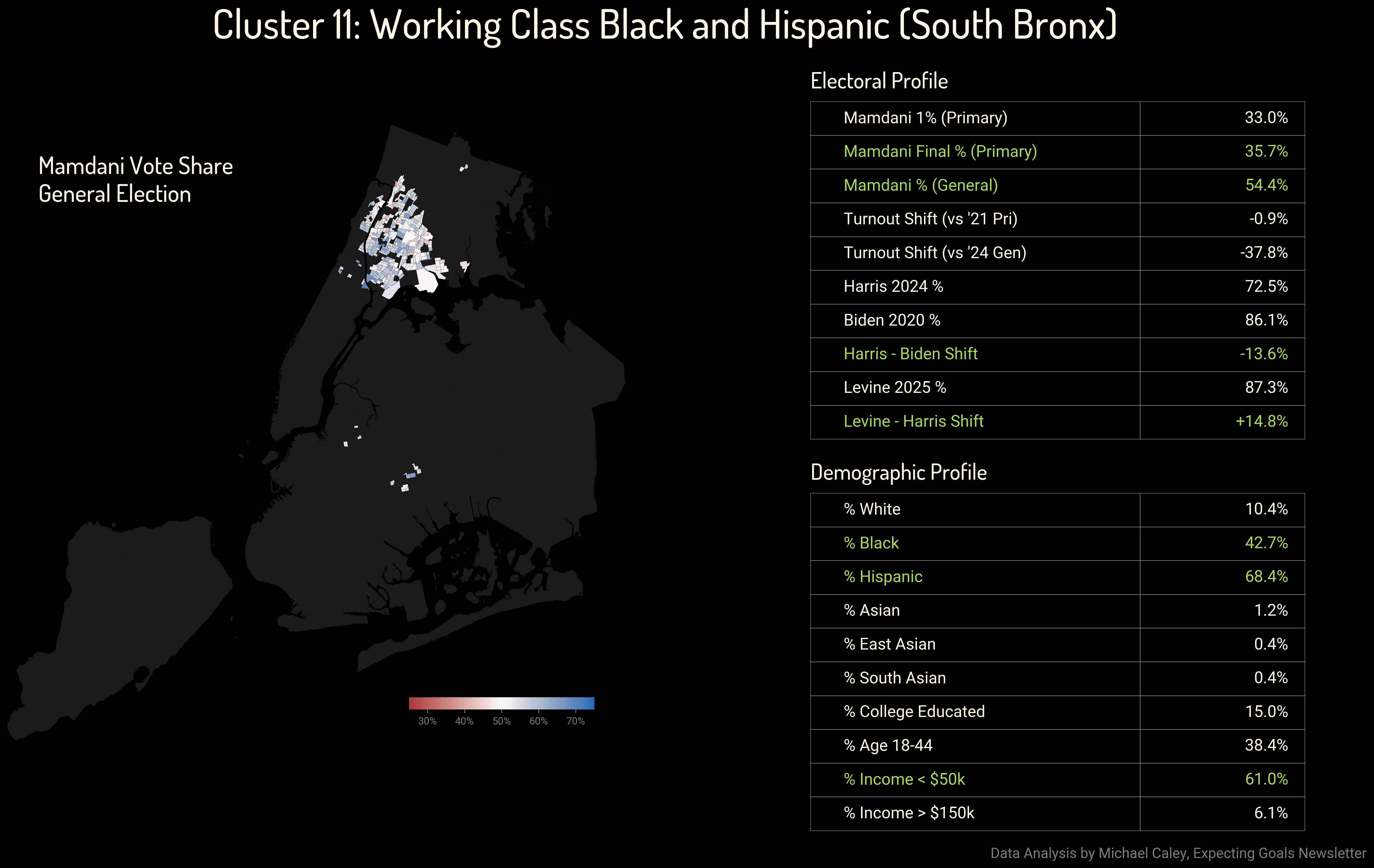
The black and Hispanic South Bronx, which contains many of the poorest neighborhoods in the city, tells a similar story about the Mayoral election as Mamdani gained about 20 points between the primary and the general.
In 2024, the Bronx was a surprising epicenter of Democratic losses, as even in 2022 Kathy Hochul’s vote share in the Bronx had held up reasonably well. Just a year later, Mark Levine won back the double-digit losses Democrats had suffered in these districts.
Cuomo Conservatives and the Manhattan Mystery
Cuomo’s base in this election was Republicans and Manhattan.
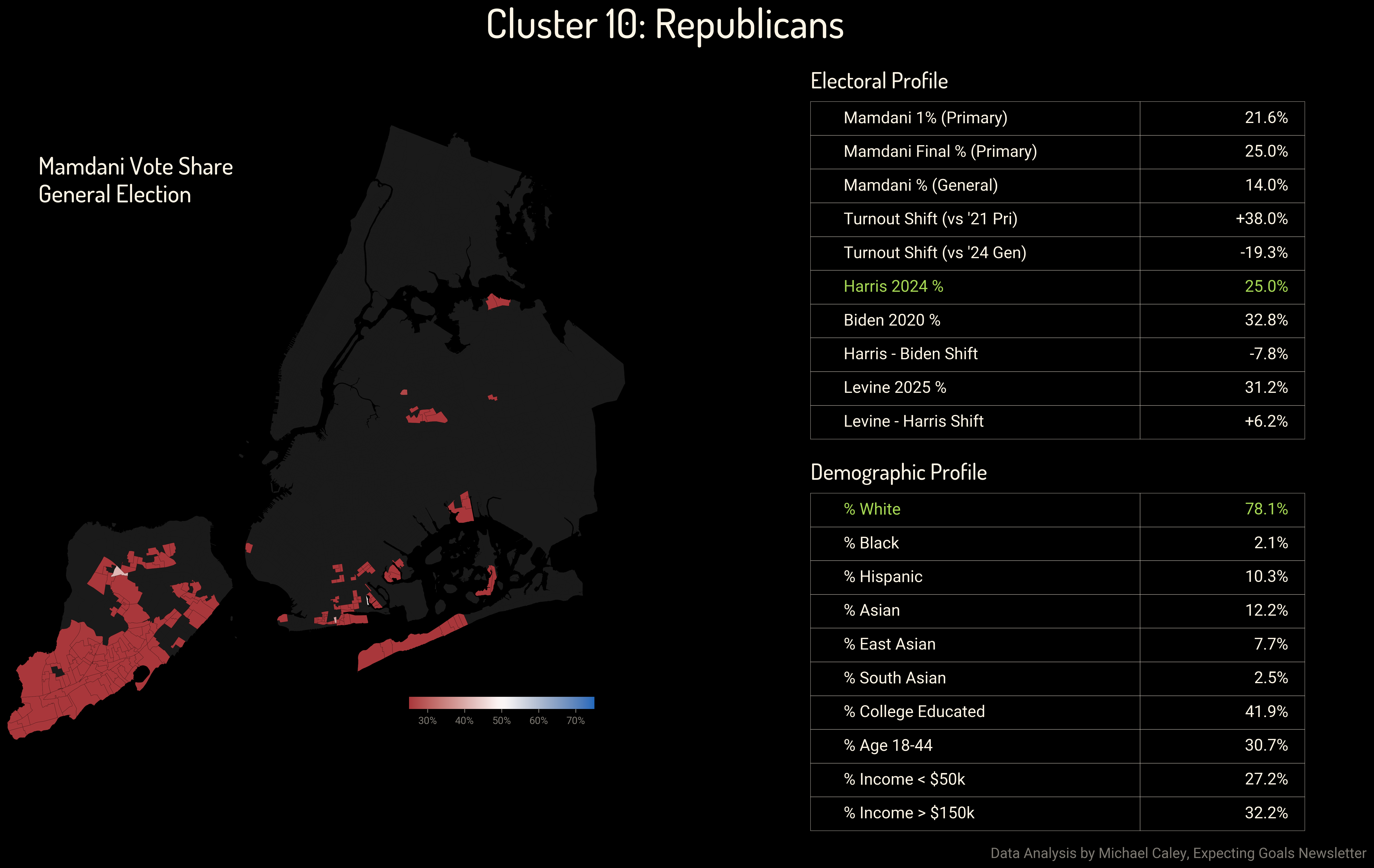
I’m sure there is much diversity in the many neighborhoods of Southern Staten Island, in Brighton Beach, Breezy Point, and other highly Republican areas. But the model saw Harris at 25 percent and lumped them all together. And for the purposes of looking at the 2025 election, this is correct. Republicans were motivated to vote against Zohran Mamdani and they did so by enormous margins.
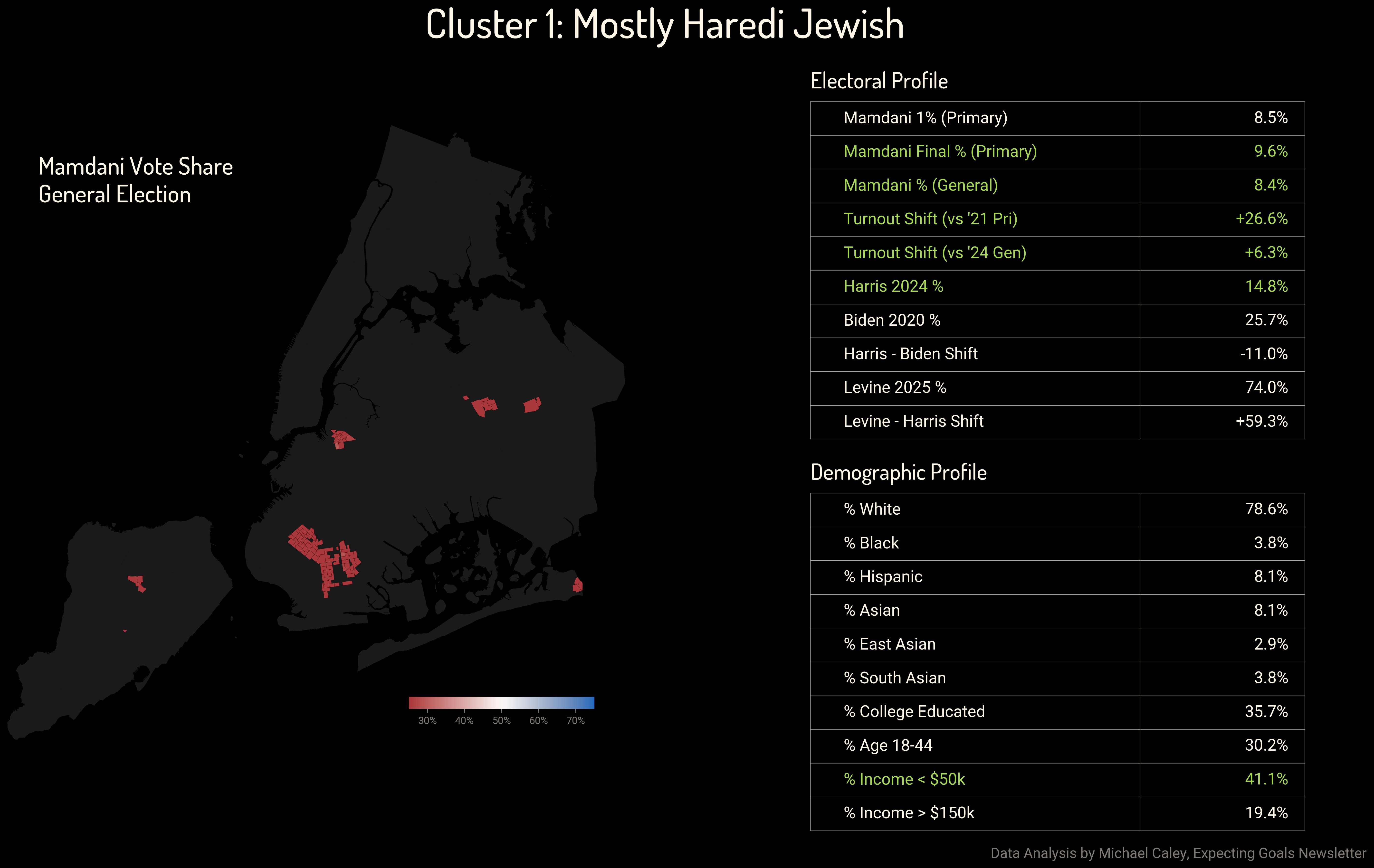
Those margins and turnout, however, were nothing like what Cuomo racked up among Haredi Jewish voters. Mamdani won under 10 percent of the vote in these areas and turnout even increased from the 2024 general election.
One of the reasons I decided I would publish these clusters is that the model found most of New York City’s Haredi communities despite the fact that the census has no data on religious affiliation. The peculiar voting patterns and demographics of these neighborhoods identified themselves to the clustering model.
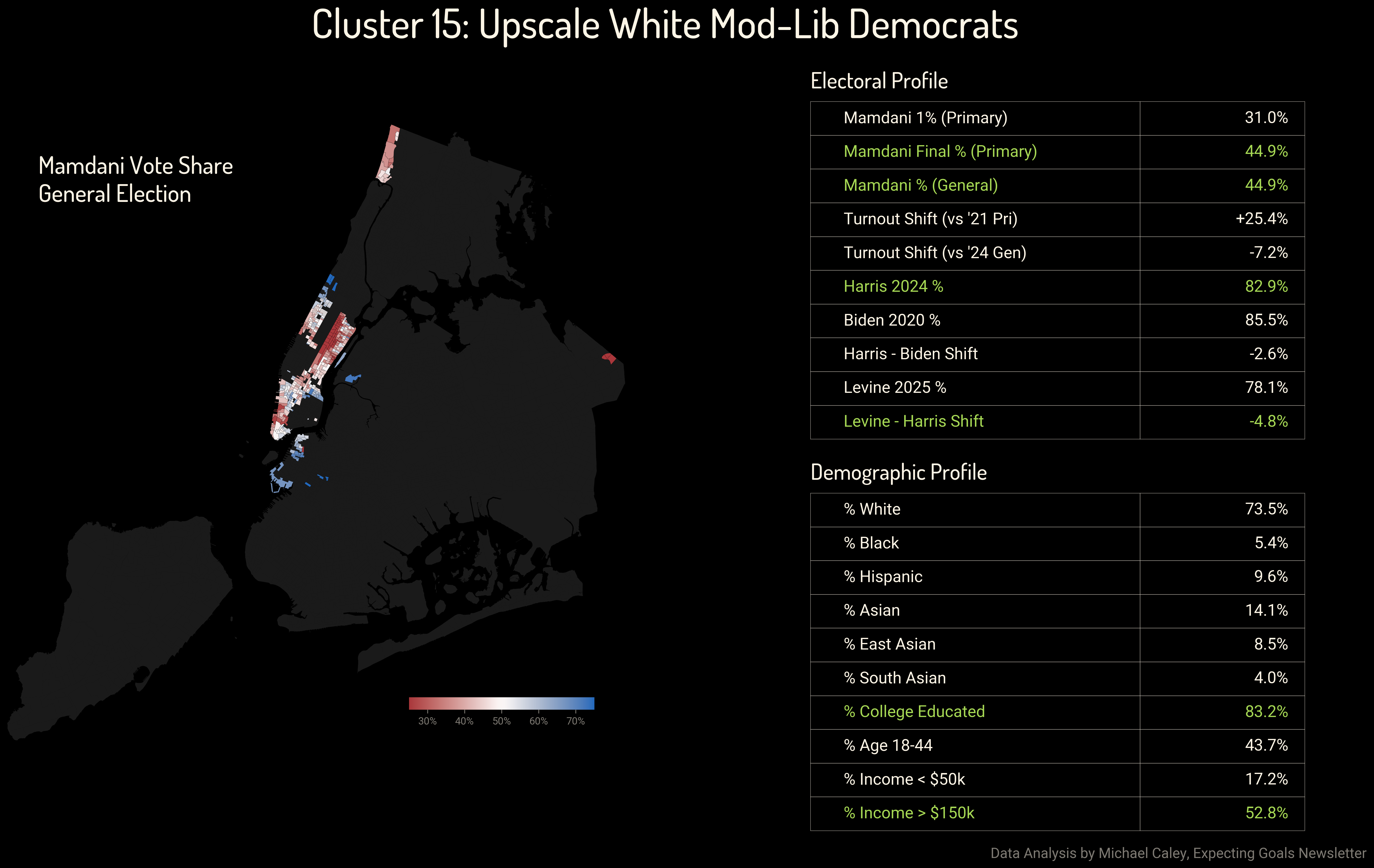
So finally we are left with Manhattan. These are wealthy, mostly white areas that have historically voted for Democrats by enormous margins. And ultimately, they did support Mark Levine 78–22. But in an election where Democrats were running well ahead of their baseline everywhere, even in Staten Island, it is notable that Democrats lost ground in Manhattan, as well as in Riverdale in the Bronx.
As I said in my election analysis, I would guess that the dynamics here are peculiar to Manhattan and Riverdale. It will remain to be seen whether Manhattan moves to the right while the rest of the city moves left.
On New York City: The Big Apple: The Greatest City in the World
This model helps to demonstrate the immense complexity of New York City’s politics. There is no single ‘Democratic Base’ or ‘Working Class’ vote in New York City. There are many distinct political ecosystems, and the political climate of the 2020s has impacted them in similar but never identical ways.
While the topline result showed a city swinging back to the left, that shift was built on a complex coalition. Young progressives in Astoria, older Black homeowners in Jamaica, and South Asian families in Richmond Hill ended up voting in similar ways, but they all took different paths to get there, through the 2020s and then during the primary. And that’s just in Queens alone. The underlying dynamics which made New York City a bellwether for the nation in recent years likely stem from this very complexity. Whether we want to understand New York City for its own sake, or for what it can tell us about national political dynamics, we must start with this diversity before identifying the trends that can tie different people and different neighborhoods together.
Appendix on Method
This model was built from publicly available data from the US Census Bureau and the New York City Board of Elections. There is an enormous and probably incomprehensible public spreadsheet with the data I used for this analysis which you are welcome to play around with. The census provided information on race/ethnicity, class and education. The election data focused on dynamics since 2020, looking at general election outcomes in 2020, 2021, 2022 and 2024, as well as primaries in 2021 and 2025. This took into account total vote share, changes in vote share between elections, and shifts in turnout.
I merged the census data with the election data by extrapolating from geographical overlaps between census tracts and election districts. Because New York City updates its voting districts every year, sometimes more than once a year, older election results are also extrapolated according to geography. (This is why, if you look at the spreadsheet, it is assigning fractional votes to Joe Biden and Eric Adams. That’s from the geographic extrapolation.)
The “Gaussian Mixture Model” took this data and reduced it to 20 clusters. Five of the clusters had to be discarded as ultimately incoherent. Two of the clusters made much more sense grouped together than separated.
Broadly, machine learning is only as good as the data you feed into it and your ability to make sense of its outputs. I knew which data I had used in the past to explain political trends in New York City, and I provided those to the model rather than every single line of data I could find. The results of the model were, to my eye, shockingly compelling and coherent. But still five of them did not work at all. So I selected the ones that did appear meaningful, and that’s how this newsletter came to be.